Friday, April 30, 2010
My Creative Scrapbook LE sneak peek
I was so delighted to be invited back this month to work with the talented team at My Creative Scrapbook, especially on the Limited Edition kit, which is so jam packed with beautiful paper and such a wide variety of embellishments that all go together so beautifully. You will not believe the flowers, lace and ribbon! From this one kit I was able to do 5 layouts and 2 cards and still have paper left over to do another layout with some of my own embellishments! I have included a sample of each one of my 5 pages on this post. Even though the embellishments and papers go together so beautifully, it is amazing to see how different each designer's page's look so it is often hard to tell they came from the same kit. I can't wait for everyone to see the reveal on May 5th at http://www.mycreativescrapbook.com/gallery.htm, not only of the gorgeous Limited Edition kit, but for all the fabulous kits offered at MCS. There is one suited to every style of scrapbooker!
Thursday, April 29, 2010
sentimental memories
This page is loaded with Prima goodies. The papers are from the "Shabby Chic" and "Raspberry Tea" collections. The blooms are "Quarry" tea rose and "Athena -Aurora" collections. The "Tres Jolie miniature vines are just perfect for circles.
The butterflies are some I scanned from Webster's Pages and hand cut. The gate is a Silhouette cut. The lace is more of the gorgeous collections I purchased from "a million memories.com." The rub-ons are "Vintage Love" by Glitz.
Wednesday, April 28, 2010
"max @ whiskers"
When my sister Catherine and Brooke joined to make a family they brought together "big dog" Ray, and "little dog" Lily, who are pictured above getting a bath. Below Lil can be seen making herself quite at home in a way Ray cannot!
Tuesday, April 27, 2010
I love to scrapbook.
Please allow me to introduce you to my shadow, DC, our Burmese Velcro kitty. "DC" originally stood for "Devil Cat." Russ picked her out at the animal shelter and named her partially for her color and partially because he likes the band "ACDC" and our yellow tom cat, Arthur Cat, is the "AC" part of the equation. The two of them have an electric relationship that reminds me of the one my oldest two sons had as youngsters. Just 13 months apart in age, they could not be more different in appearance and personality. Bryant has been the strong, silent type since he was a baby while Ben has always been a tease from hell. He would pester and torment his big brother until Bryant had taken all he could and then Ben would run to me to save him from the wrath he eventually incurred.
Since DC has always been at the bottom of the pecking order, it used to be that when she came tearing across my lap with Arthur on her heels, I would capture him and toss him out the door to save her. It was some time before I realized that this was Ben and Bryant all over again. I witnessed Arthur walk innocently past DC, who was perched on the couch, and watched as she reached out, took his tail between her paws and bit! Then she came running to me for help when he responded!
The pecking order came into question when our long haired Birman, Duchess, had her first hair cut. Being the eldest, and royalty, she was accustomed to ruling the roost. Her long hair and big lions' ruff helped her pull this off since it camouflaged her size and lent her dignity. She was 13-years old at the time of her first hair cut and it was entirely due to the matted condition of her hair which could no longer be combed. I was, myself, shocked at how tiny she is underneath all that fur!
If you don't believe cat's have emotions then you have not seen a humiliated, shorn alpha duchess! She was as embarrassed as anyone caught naked and retreated to her throne, (the back of our recliner), with a defensive glare. DC, the hero of this narrative, went strolling by, caught a glance of Dutch out of the corner of her eye, and I swear to god, stopped short in her tracks, backed up, sat directly in front of her highness and gazed with rapt bemusement until Dutch could stand it no more and hissed. Completely unruffled, DC rose at her leisure, raised her tail with the air of someone newly promoted and strode away with a new confidence and authority in her stride!
While I enjoy her companionship while we scrap together, I must be extremely diligent in closing DC out of our scrap room while I am away since she prefers the entire house as her canvas for her independent work.
On this collaboration we used BASIC GREY "max @ whiskers" collection pack, along with our won flourishes created with transparency paper, fabric glue and patterns scanned from Prima flourishes as well as some PETALOO blooms. We used FISKARS deco-edge scissors for the circle border. A special thank you to the talented NikkARNGwife @ Scrapbook.com from whom I lifted this design.
DC and I thank you for stopping in and sharing in our fun!
Monday, April 26, 2010
forever bride - color room challenge
I decided to join the fun at The Color room and love this week's palette, which is just perfect for the color photos of Katie's April wedding. Doesn't she have the most beautiful eyes? I think the combination of blue with her dark lashes and hair is so striking. She and her sister Melissia both got this combination from their dad. Lucky girls!
For this layout I used a combination of PRIMA Tropics "Celery Splash" and K@COMPANY "wedding" papers. I inked the corner with MARTHA STEWART purple ink and used the package backing from the Prima flowers as a photo mat. I'm still practicing my stitching, which looks better with the embroidery floss than with the thread! I used a FISKARS embossing border punch and hand doodled the light wavy border with SMOOCH. The bird cage, swirl and title are SILHOUETTE cuts, and I also used the Smooch to paint the bird.
The bird vine, flowers and jewels are all PRIMA. I hand cut the green flowers from the Prima paper and used Smooch and lavender STICKLES to enhance them.
Thank you so much for taking a look. Your comments mean so much to me!
Friday, April 23, 2010
May I have this dance...
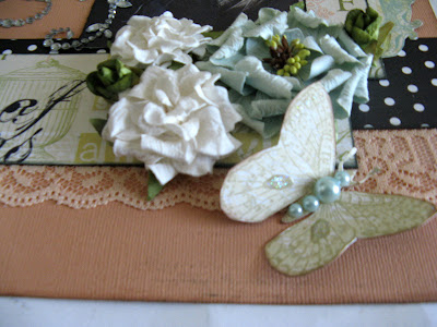
More of Katie and Tim's wedding pix that go so well with these GRAPHIC45 Le Romantique papers. This collection just seems suited to over the top flowers, lace, butterflies and pearls, and I added plenty. I used both PRIMA and Petaloo blooms as well a Prima E-line pearls. I inked the inside edges of the peach lace with black TIM HOLTZ paint dabber and hand stitched it to the paper... still struggling with the stitching, as you can see! I also did lots of hand cutting from the Graphic45 papers, and lots of inking and distressing.
Thanks so much for visiting.
Thursday, April 22, 2010
Key to my Heart
I used GRAPHIC45 Le Romantique collection papers and actually tried sewing on this page. I'm going to pretend that I intended it to look so distressed since I spent so much time doing it that I wasn't about to discard it! The butterfly is clip art than I printed out on white card stock and hand cut. The rub-on swirl and "joy" are tLc.
I cut out the floral base from a sheet of the G45 paper and topped it with Prima flowers. That tiny butterfly was also cut from G45 pp. The "Superior" stick pin is made by JBS.
Thanks so much for stopping by.
Friday, April 16, 2010
Rock Star
Madscrappertoo got to me with her last post about scrapping outside of her comfort zone. I've been in a creative rut, so decided to follow her example and try something completely new and used her style as inspiration. It is certainly lacking the finesse of her designs, but I had all kinds of fun trying and maybe with time and practice I'll get better.
This layout largely features the SILHOUETTE which I used for all the shapes and letters. The papers are SCRAP WITHIN REACH "Emerson" collection and the flowers are PETALOO. I also used BASIC GREY stamps, bubble wrap, and a MARTHA STEWART border punch.
Wednesday, April 14, 2010
Life's Portrait
I have had so many scrappers express to me their reluctance to cut into the gorgeous Webster's Pages patterned papers, and I know just what they mean, but that is one of the great things about WP! While they are beautiful enough in their original form that a casual scrapper can just add their pictures and an embellishment or 2 and have a gorgeous page, those of us who are more, shall we say passionate, about scrapbooking as an art form, can cut out elements, rearranging, mixing, and layering to create pages that are unique to us and sometimes barely resemble the original pp. The birdcage above was cut from one sheet of pp, and the bird and flourished circle from and entirely different pp. I lifted them both on foam pop up adhesives.
I also cut the title from a sheet of pp. The ribbon flowers were made my using thread and needle to stitch a running stitch up one side of the ribbon, then gently gathering it and attaching the ends with a final stitch to connect the 2 ends in a circle to which I attached the PRIMA rose with a glue dot.
The border is a MARTHA STEWART punch. I wove the ribbon through 2 closely punched holes, a technique I learned from a picture tutorial on Gabrielle Pollacco's blog: "Such a Pretty Mess." A link is provided on the side bar. There was just enough ribbon left to fold to the center, attach with a stitch and then gather into a bow with wire, and then complete with the WP cameo with a glue dot. The cameo and PRIMA e-line pearls are the only elements I added to this layout that were not included in the kit. The white flowers are also hand cut from one of the patterned papers. The flowers are all PRIMAS.
Thank you so much for taking the time to visit.
Together Forever
Monday, April 12, 2010
Cheers
Every single element on this page was included in the April main kit from "MY CREATIVE SCRAPBOOK,' except the doily, which I cut on my Silhouette, and the small butterflies I previously scanned from other WPs , printed and cut out. It includes papers, a vellum sheet, stickers, and alphabet stickers from the WEBSTER'S PAGES "Life's Portraits collection along with TERESA COLLINS "Welcome home" chipboard embellishments and PRIMA flowers.
4th grade
This is another page using the fabulous April kit from "MY CREATIVE SCRAPBOOK" featuring WEBSTERS PAGES "Life's Portrait" collection, TERESSA COLLINS "Welcome Home" chip board embellishments and PRIMA flowers. Everything on the page but the cardboard, cardstock, paint, PRIMA e-line pearls and leaves came in the kit. I prepared the cardboard with TIM HOLTZ linen crackle paint and SHIMMERZ "pumpkin" paint.
Thank you so much for dropping in.
love yourself
One of my very favorite days of the month is the fifth because it is reveal day at "My Creative Scrapbook." Pam Rangel puts together such gorgeous kits, and the design team is so very talented. They are artists I have admired since discovering the online scrap book community. After the fifth, my next favorite day of the month is the one when my kit is delivered, and April's kit did not disappoint! Full of Webster's Pages "Life's Portrait" collection papers, stickers and alphabets, along with a gorgeous assortment of Prima flowers and the bling swirl below, along with Teressa Collins "Welcome Home" chip board and several lengths of ribbon and lace. I couldn't wait to get going on it and did 3 layouts over the week end!
I love the butterflies on Webster's Pages, and often cut them out if they will be covered by other elements of my design to use else where, but also scan and save them so I can print out different sizes on plain ole white card stock to use on layouts and cards. That is what I did with this page.
I actually used flowers from my own stash on this layout, and just love the mini Prima vines. The green roses did come in my kit, but the Prima Mulberry Flower Embellishments came from my own collection. I cut this butterfly from the patterned paper, inked its edges, added some crystle clear Stickles and Prima e-line pearls.
Sunday, April 11, 2010
Flowerpatch
I had to laugh when visiting my favorite scrap booking site (Scrapbook.com) where I read the description under a layout of the extremely talented artist, Madscrappertoo. She has such a distinctive modern, grunge type style, but said she was trying to step out of her box and do something pretty; something she finds so hard. She did it beautifully I might add. "Pretty" is what comes easily to me. Give me flowers, swirls and lace and I'm off and running. Cute, masculine, modern, now that's an entirely different story. I often marvel at the versatility of artists like my dear friend Luzma who can move so comfortably from style to style. I do so love cute papers, and they don't come much cuter than this IMAGINISCE Lucy Bird collection, so this is me stepping out of my box again. I also used a MARTHA STEWART border punch, some pink fabric glue, and a bee sticker made by SANDYLION.
The photo is of my cousin Elizabeth and her family. "Ibby" and I are just a year apart in age (she's older! LOL) and so have been buddies all of our lives.
Thursday, April 8, 2010
Greek festival
You can find a step by step tutorial on how I created this design using only 1 piece of card stock and 2 pieces of patterned paper on my post titled "making the most of your paper."
This page features the KAISER CRAFT "Gypsy" collection. The blooms are PRIMA Primroses. The leaves are also Primas, and I noticed that one that fell out of place after I saw it in these photos. It has been properly put in its place. The mini roses and pearls are also by Prima.
I cut the butterflies from card stock and patterned paper on my SILHOUETTE and then inked and layered them, adding the mini roses. The title is a combination of "Gypsy" stickers outlined in gold SMOOCH and silhouette cuts. The border punch is by MARTHA STEWART.
The pop up embellishment is one I created out of coordinating "gypsy" card stock punch outs. I provided a step-by-step tutorial on my post "pop up embellishment."
Thanks so much for stopping by.